
Modular Visuals for a
Modular fintech Brand
Payrails
Briefing
The Challenge
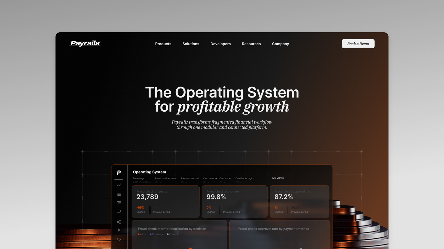
Payrails was in the middle of a major rebrand. They had raised €32M and were preparing for launch, but the visuals still needed to match the ambition behind the product.
That’s often the challenge with fintech: the product is powerful, but hard to show. You’re selling infrastructure, trust, speed, and control — not something people can instantly see. If the visuals stay too generic, the brand quickly blends into the usual world of gradients, dashboards, and abstract tech imagery.
So the goal was to build a 3D brand world that made Payrails feel premium, human, and unmistakably their own — flexible enough for the website, presentations, social assets, and future brand touchpoints.
Not just one nice render. A visual direction that could carry the brand.

Benefit 01
Scalable Brand World
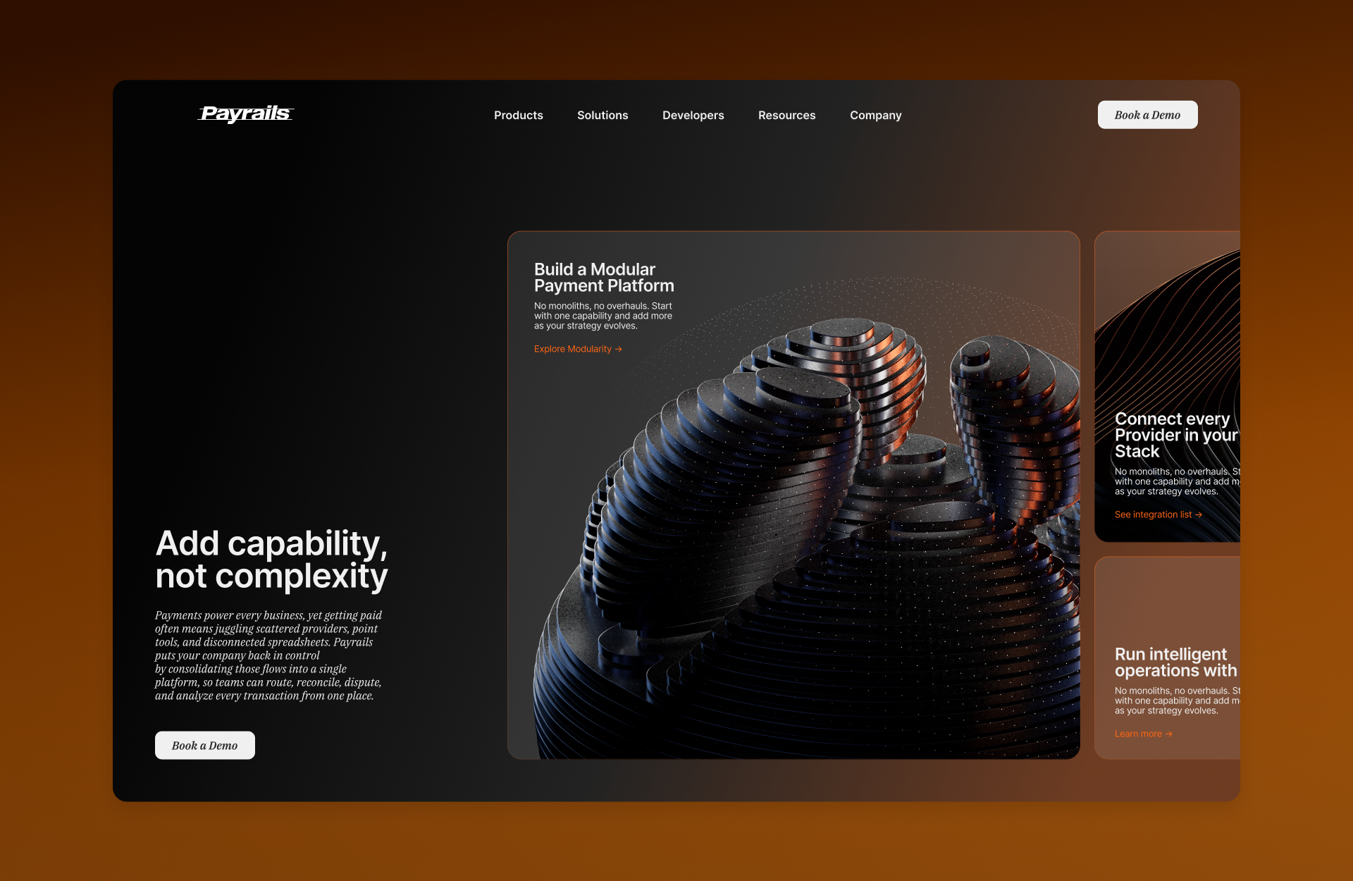
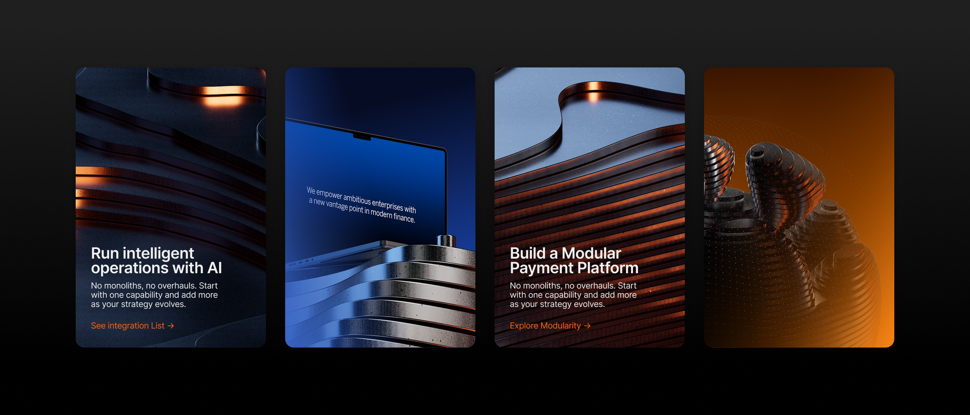
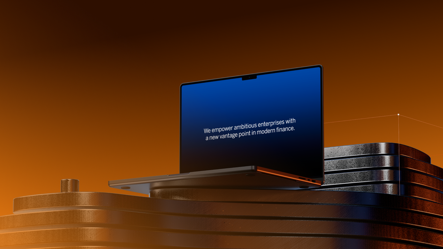
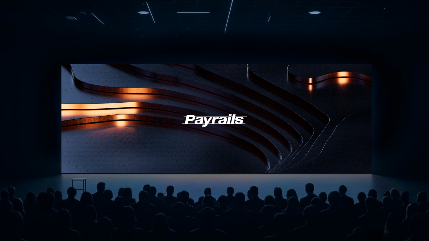
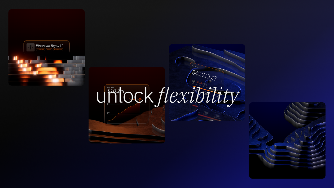
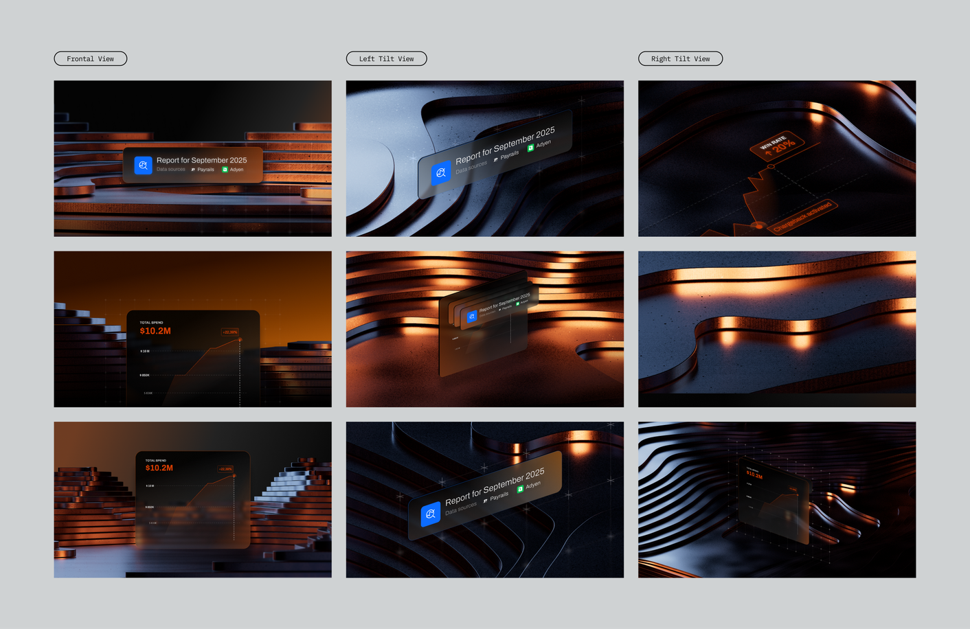
The final direction expanded from one core key visual into a set of reusable assets: a 6K hero image, 10 static 4K key visual variations, animated key visuals, light-version assets, mockup visuals, source files, and documentation for the Payrails team.

Benefit 02
Premium Fintech Feel
For a fintech brand, premium perception is not just about looking polished. It signals trust, maturity, and leadership. In a crowded market, a stronger visual presence helps the brand feel more established, easier to remember, and better positioned to win attention, confidence, and market share.

Benefit 03
Product Made Visible
In infrastructure-heavy categories, the product value is often invisible at first glance. A brand needs a way to make its role instantly understandable: what it enables, why it matters, and why it is different. Clear product perception helps shorten the distance between “what is this?” and “this feels important for our business.”
The Result
A Brand World
Two Layers
Visual System around payment as flexible layers
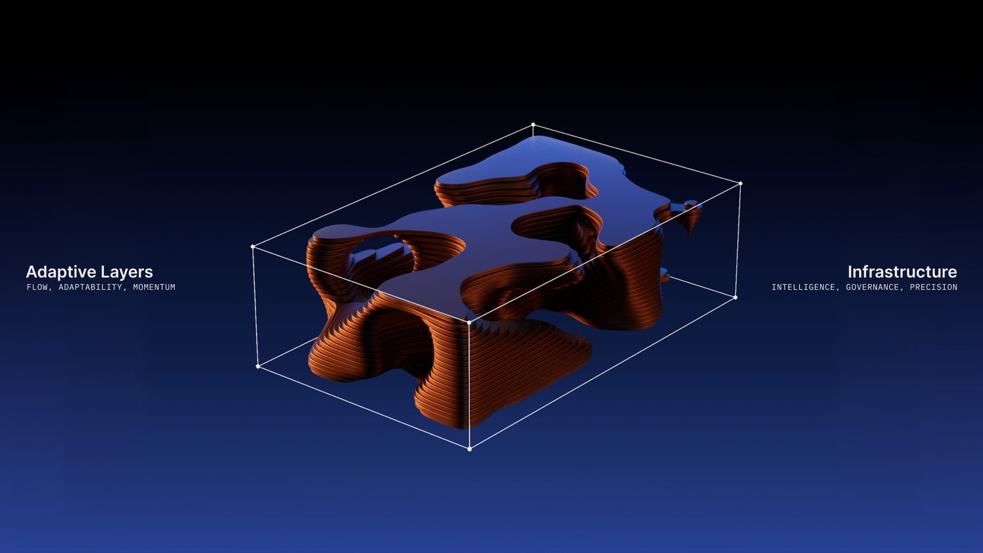
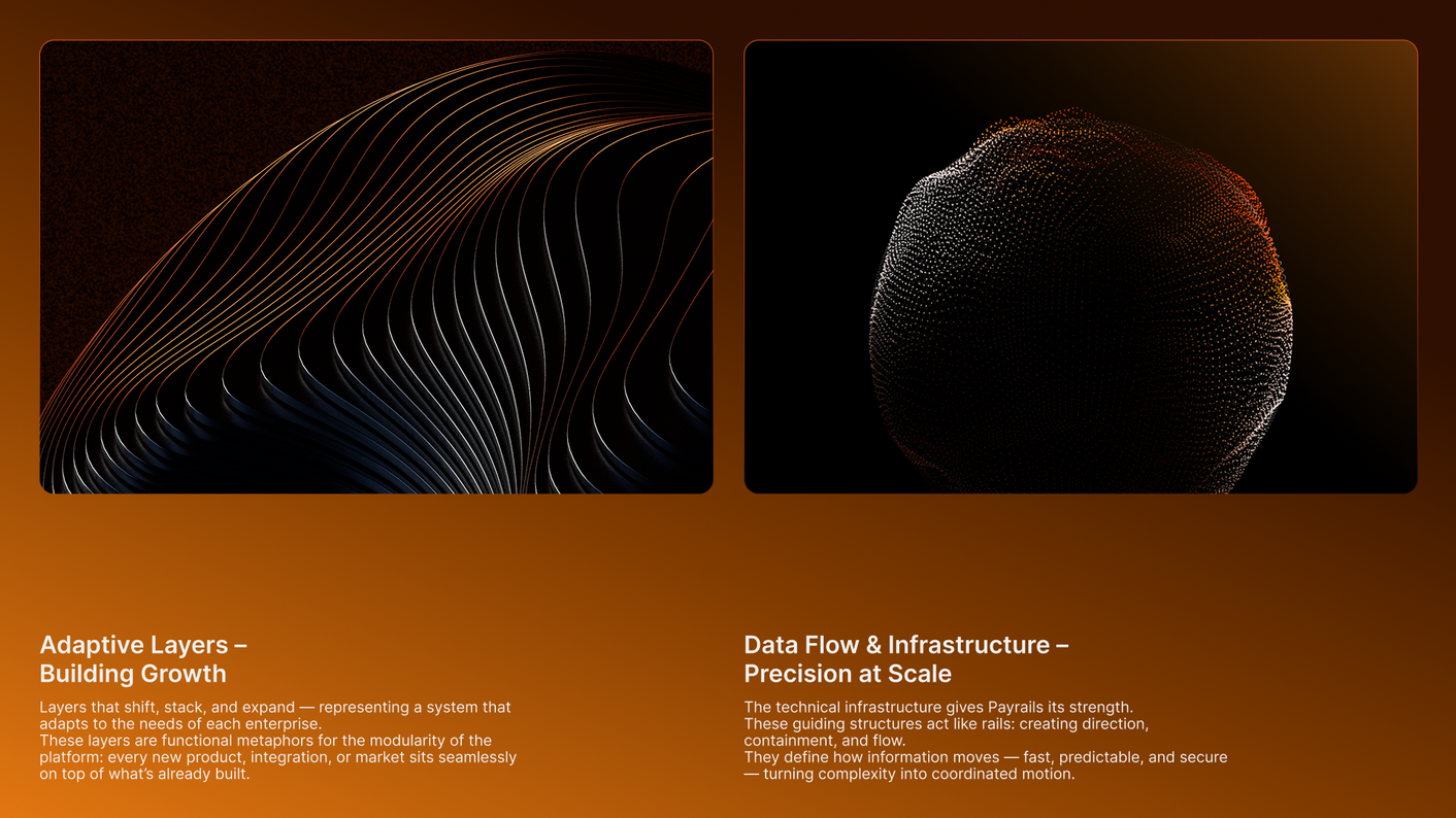
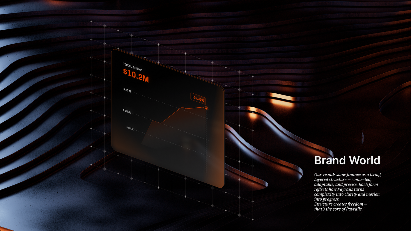
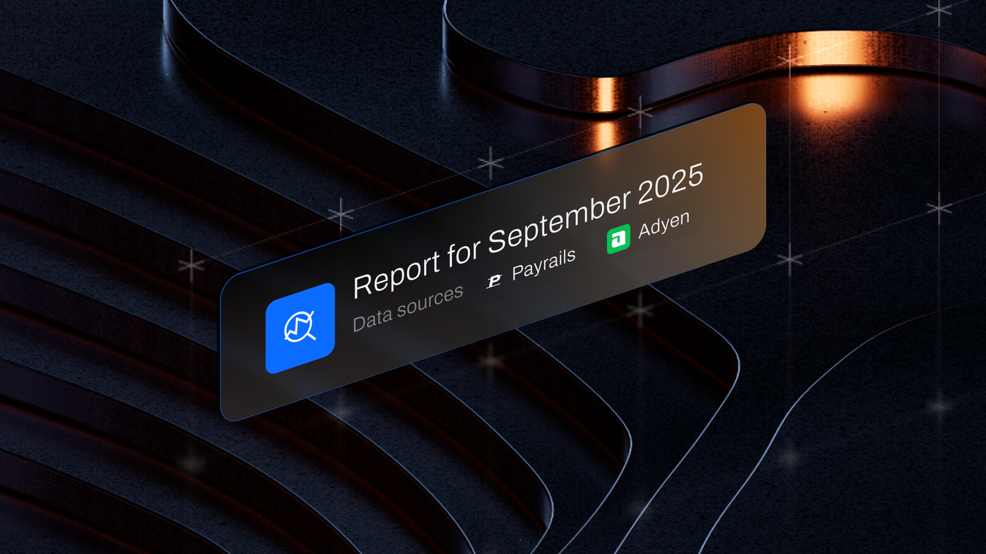
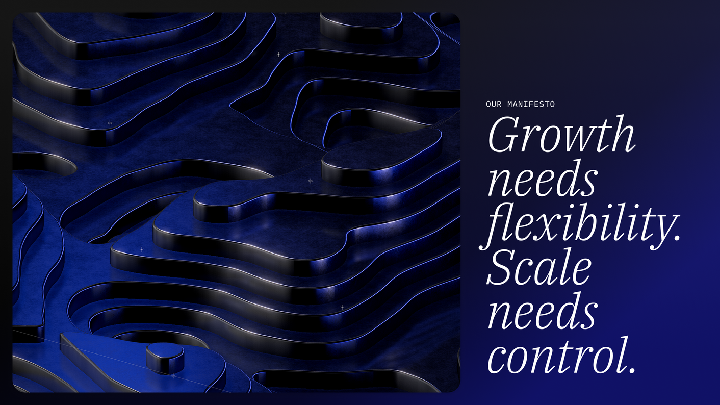
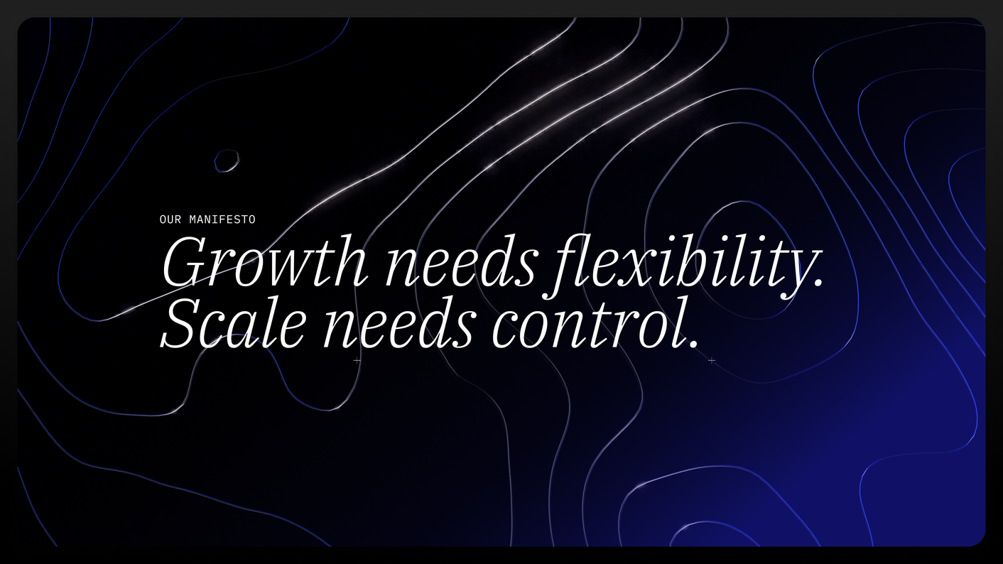
The first element is the organic landscape. These forms are layered, shaped, and constantly growing. They feel effortless, almost natural — like financial movement that can expand without friction. I wanted this part of the world to bring a human quality into fintech: flow, adaptability, momentum, and progress. It prevents the visuals from feeling cold or purely technical.
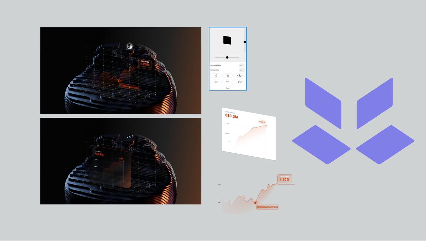
The second element is the tech layer. Fine dots surround, scan, and sit around the organic forms. They feel like a reasoning layer: reading what happens, checking it, approving it, and keeping it inside a controlled environment. This layer adds the sense of intelligence, governance, and precision that a payment infrastructure brand needs.
Together, these two elements make the visual world feel unmistakably Payrails. The organic landscapes communicate growth and flexibility. The dot-based tech layer communicates control, validation, and operational intelligence. One side shows how finance can move and evolve. The other shows how Payrails keeps that movement structured, approved, and reliable.
That balance became the core of the direction: flexible growth, controlled by intelligent infrastructure.
Built to Grow
The 3D Toolkit
The visual language we developed for Payrails had potential beyond the initial delivery. When I saw the team using AI tools to create new variations, I recognised a need for greater creative independence. And an opportunity to build on the system we had already established.
Some of those experiments drifted from the original aesthetic. On my own initiative, I developed a 3D toolkit to demonstrate how the team could expand the visual language while retaining its character and quality.
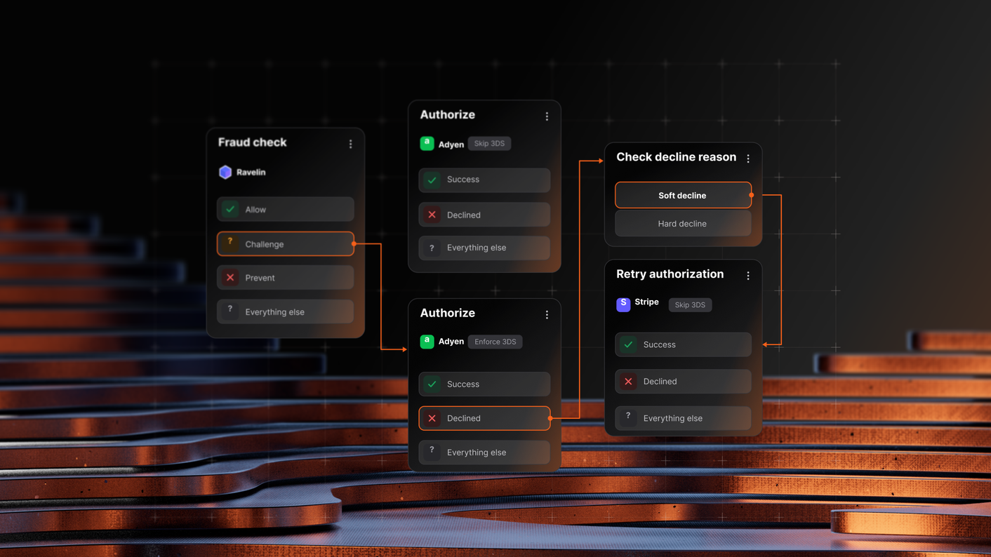
The toolkit lets the team explore compositions and colour palettes, apply depth of field and bounding boxes, and combine 3D visuals with UI elements in editorial-style layouts. It also supports still image and animation exports.
It extends the original delivery into a tool for ongoing creation—giving Payrails the means to produce a steady stream of varied, consistent brand content independently.
Process
I approached the project in four clear phases.
I started with a kickoff and research phase to connect the visuals to Payrails’ brand values, market position, and launch goals. It was clear early on that the work needed to support a larger rebrand, not just produce a set of isolated 3D images.
From there, I explored several visual routes: topographic landscapes, fog, modular mercury forms, material intersections, and more structured geometric ideas. Seeing these options next to each other helped the team identify what felt most Payrails: premium, organic, atmospheric, and less generic than the usual fintech visual language.
Once the direction was clear, I refined the system and produced the final assets: the core key visual, static variations, animated visuals, source files, materials, and documentation. The result was more than a finished image — it became a reusable visual asset base that the Payrails team could keep building on after the project.

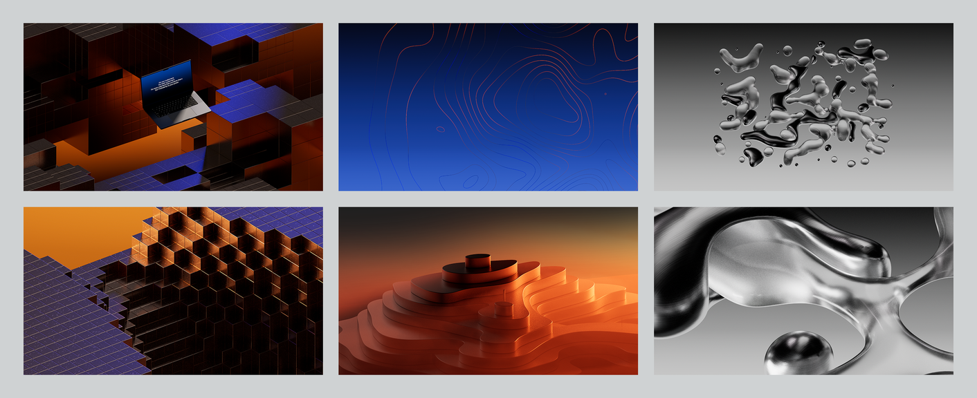
Testing ways of visually way to convey "modularity"
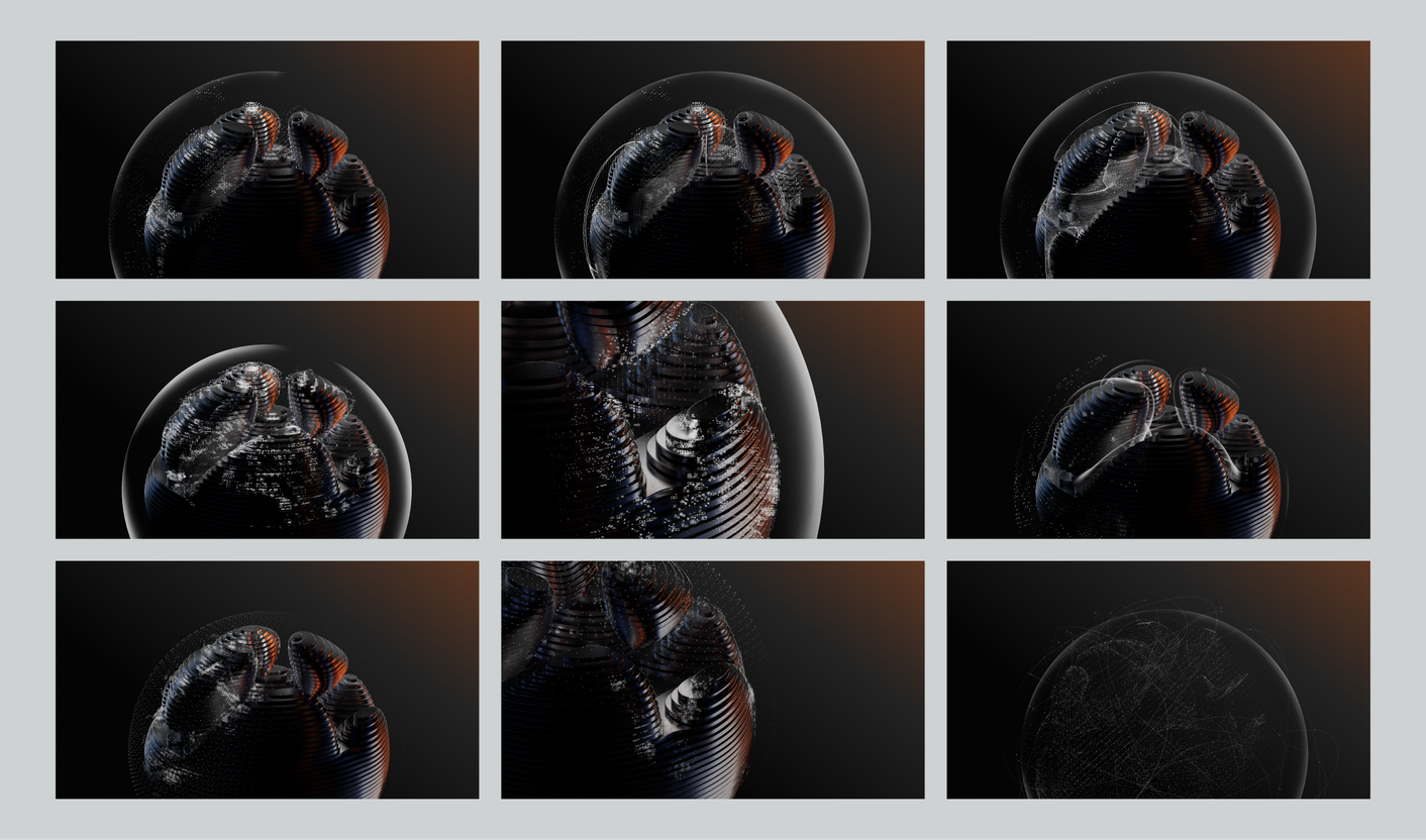
Figuring out the level of detail for the Infrastructure layer

"Tobias dazzled and delighted us at every stage of our project together. He quickly proves his value as a partner in the brand building process, and creates meaningful 3D worlds that give brands a sense of place and prestige."
Andrew Connoly
Brand Manager, Payrails
Ready to elevate your Brand?
Use 3D Design & Animation to craft a visual language that sets your brand apart, builds trust, and inspires your audience — with assets that easily scale across touchpoints.
✓ 100% Free Consultation, ✓ 100% Risk-Free
