
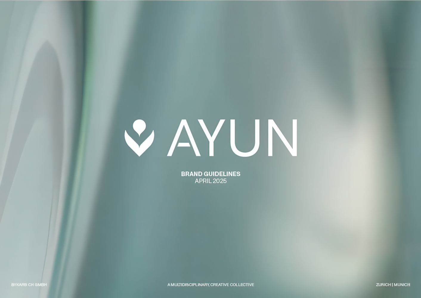
AYUN’s Visual Rebirth
byKarb
Briefing
The Challenge
AYUN Longevity Clinic is a premium brand offering high-end services in the health and wellness sector. When bykarb approached me to collaborate on the visual rebranding, the core issue was clear: while the strategy and verbal identity were evolving, the visual side still felt flat, generic, and unworthy of the clinic’s actual service level.
The existing design didn’t reflect the transformation clients experience at AYUN. There was a disconnect between the brand’s promise and its appearance — and in today’s experience-driven landscape, that’s a risk no premium brand can afford. As CMOs know, when your visual identity falls short, so does your perceived value.
We needed to craft a new visual direction that felt elevated, refined, and aligned with the brand’s positioning in the longevity and wellness space — all while integrating seamlessly with existing elements like the logo and typography developed by bykarb.
Benefit 01
Faster Creative
Alignment
With a clear visual system in place, future campaigns and content initiatives can now be executed faster and with more confidence — saving the client time and decision fatigue.
Benefit 02
Repositioned
Brand Perception
The animated 3D key visual clarified the brand story and significantly elevated how AYUN is perceived — especially among its target audience of high-net-worth individuals seeking cutting-edge wellness solutions.
Benefit 03
Stronger Content Ecosystem
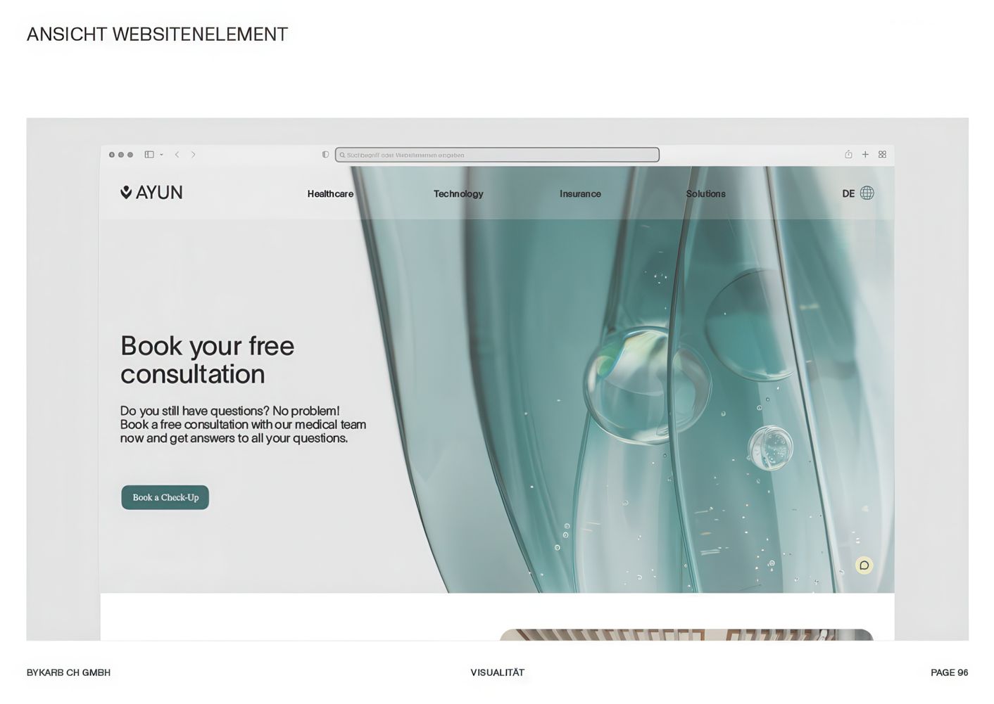
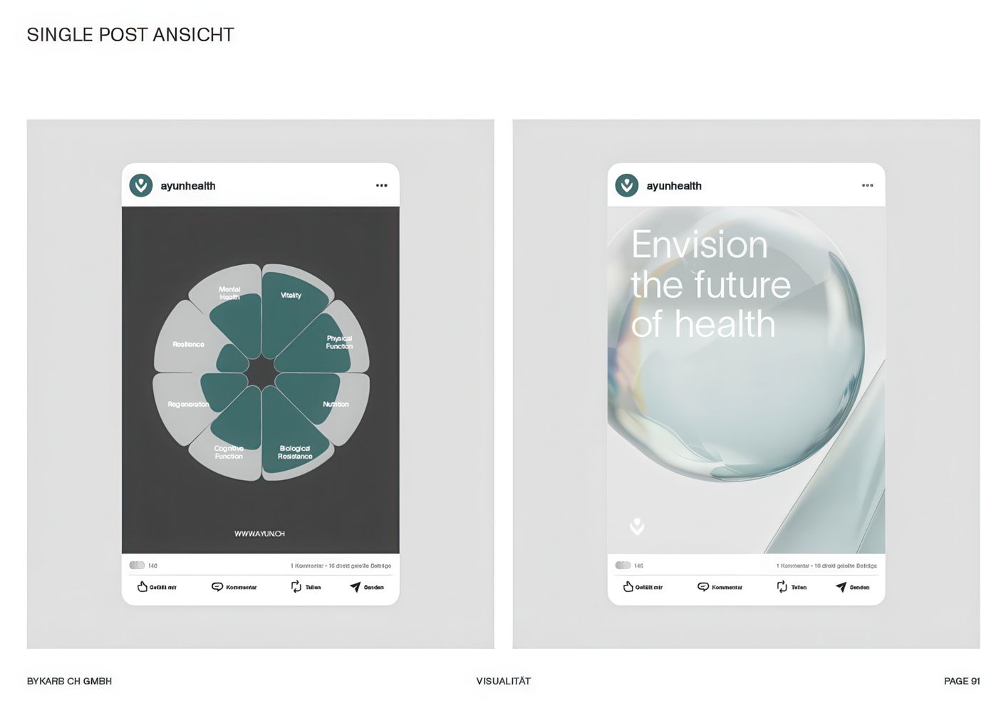
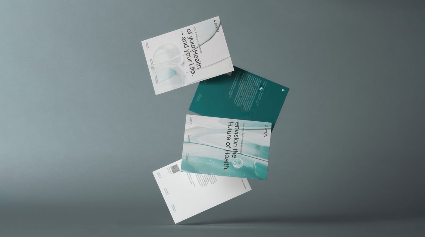
The modular 3D assets (animation, stills, closeups) now power the brand’s website and communication materials, ensuring a coherent and immersive presence across channels.
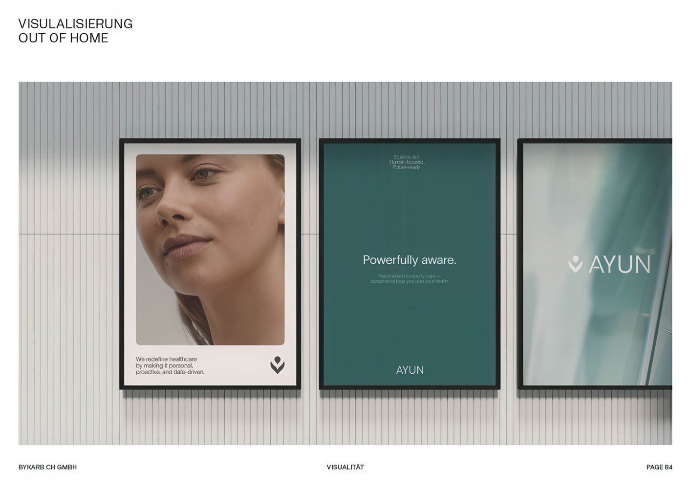
The Result
A Dynamic Rebrand
Solution
Application
To solve the challenge, I focused on making the logo's concept — a flower opening to release a single drop — come alive. This metaphor was rich, but until then, it had remained static. I reimagined it in motion: the flower slowly unfurls, its overlapping layers glowing with subtle gradients, before releasing a drop into space — a visual metaphor for rejuvenation, rebirth, and precision.
What makes this solution stand out is that it explains the logo while expanding it into a living visual system. We extracted gradients, textures, and compositions from the animation to use as brand assets — turning one core concept into a scalable design toolkit.
This approach doesn’t just look beautiful. It creates consistency, flexibility, and emotional engagement — which is exactly what modern CMOs are looking for in a design investment.
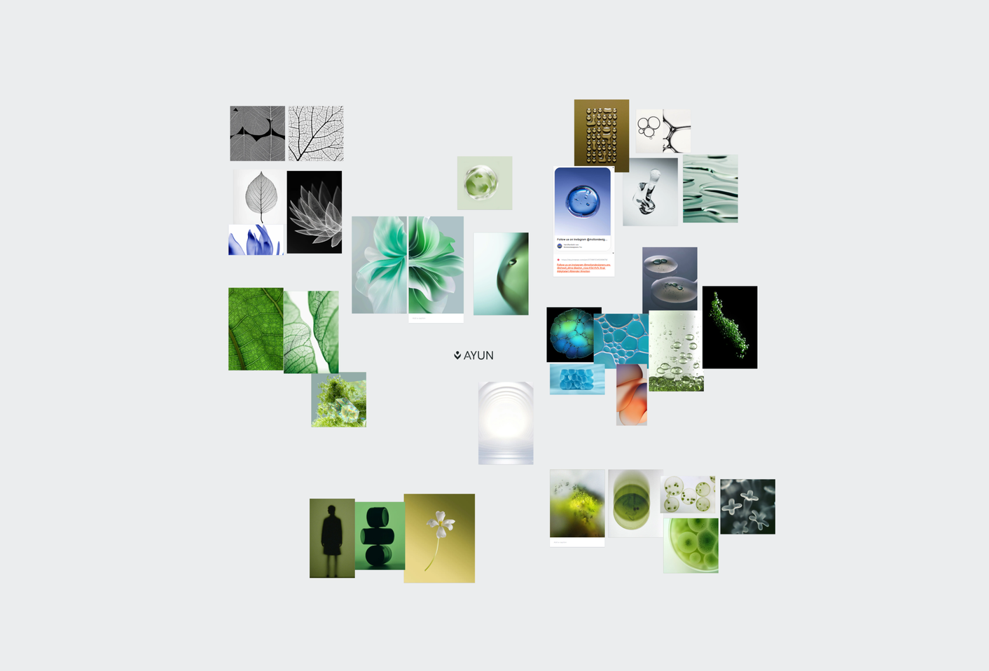
Process
Drawing inspiration
from Nature
The project began with a strategic review of the status quo and a close collaboration with bykarb, who shared a curated moodboard and their vision for the brand’s evolution.
We faced one major challenge: finalizing the color palette and animation flow while brand messaging was still evolving. To avoid paralysis, I proposed visual directions early and adjusted as clarity emerged — guiding the team with mood variations and previews.

Elevate your
Brand Identity
A visual language that emotionally connects to your audience, builds desire, and resonates with your brand's identity can only be built with a strong concept in mind.
✓ 100% Free Consultation, ✓ 100% Risk-Free
