
3D Keyvisual:
Bringing Humanity to
AI Cybersecurity
Twine Security x YAYA Agency
Briefing
The Challenge
Twine approached me with a clear mission: create a visual identity for their AI teammates — digital employees designed to support overstretched cybersecurity teams. The challenge was surprisingly human. Their assistant, Alex, solves highly technical IAM tasks, but the brand lacked a way to communicate that Alex behaves less like a tool and more like a colleague. For decision-makers in large enterprises, this distinction matters; they need to trust technology that integrates deeply into identity workflows and replaces hours of manual oversight.
At the same time, Twine needed a scalable system for their full product palette. Each assistant had its own specialty, yet all visuals needed to feel unmistakably part of the same family. And because the cybersecurity market is crowded with dark interfaces and predictable tech tropes, the visuals had to create an ownable identity that stood out — something calm, intelligent, and premium enough to resonate with leaders evaluating serious operational solutions.
Benefit 01
Enhanced
Visual Identity
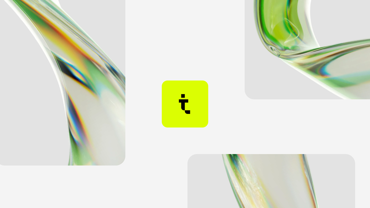
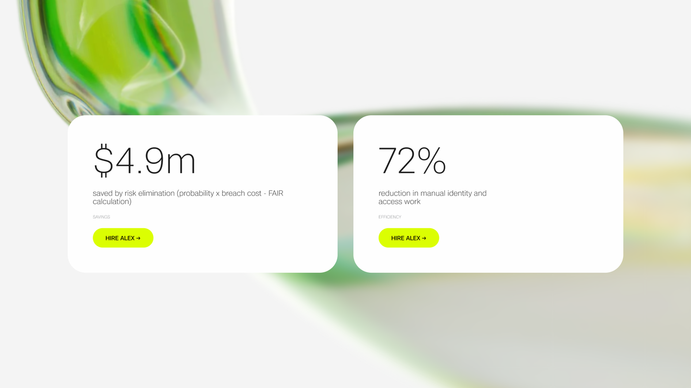
Twine has a memorable and ownable brand asset used across web, pitch decks, social, and product storytelling.
Benefit 02
More Human
Brand Expression
Twine can articulate the role of their AI teammates without overexplaining—reducing friction in sales conversations and helping the brand stand out in the cybersecurity market.
Benefit 03
Scalable
Visual System
The agency can now create product-specific visuals in minutes, not days—allowing for faster marketing, clearer positioning, and consistent brand articulation.
The Result
The result is a distinctive product visual system
that communicates intelligence, trust, and humanity.
Solution
Application
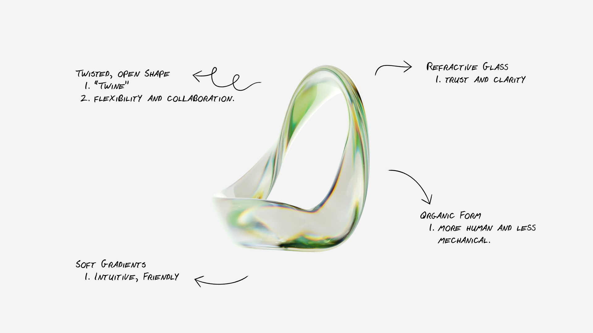
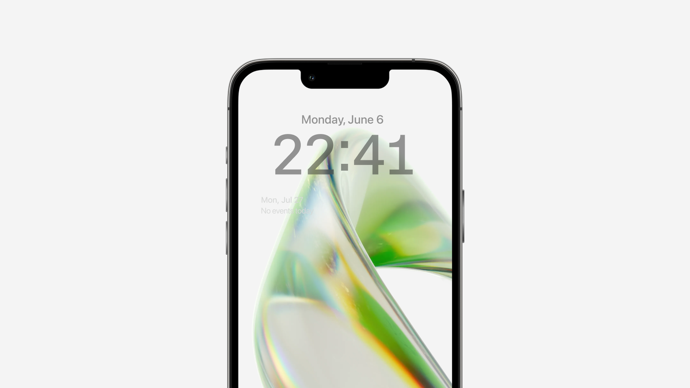
I developed an open, glass-like shape language that feels expressive without being literal. These forms communicate transparency, trust, and collaboration — qualities that align naturally with Twine’s positioning of their AI as “digital employees.” The visuals needed to suggest intelligence and responsiveness, almost like the shapes were listening and reacting, similar to a voice assistant UI but elevated into a more artistic territory.
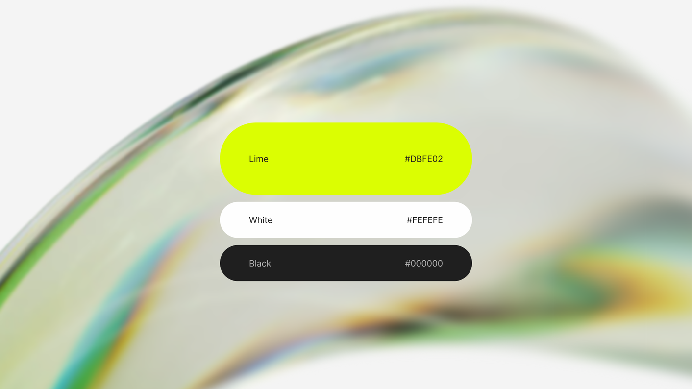
Choosing open geometries instead of closed orbs allowed the assistants to feel more alive and less conventional. Light refraction, subtle textures, and carefully composed color accents tied the forms back to Twine’s brand while giving each assistant its own personality. The final direction delivered a modern, premium aesthetic that differentiates Twine from other cybersecurity brands and strengthens the narrative that their AI bridges the talent gap with clarity and confidence.
Process
How we worked
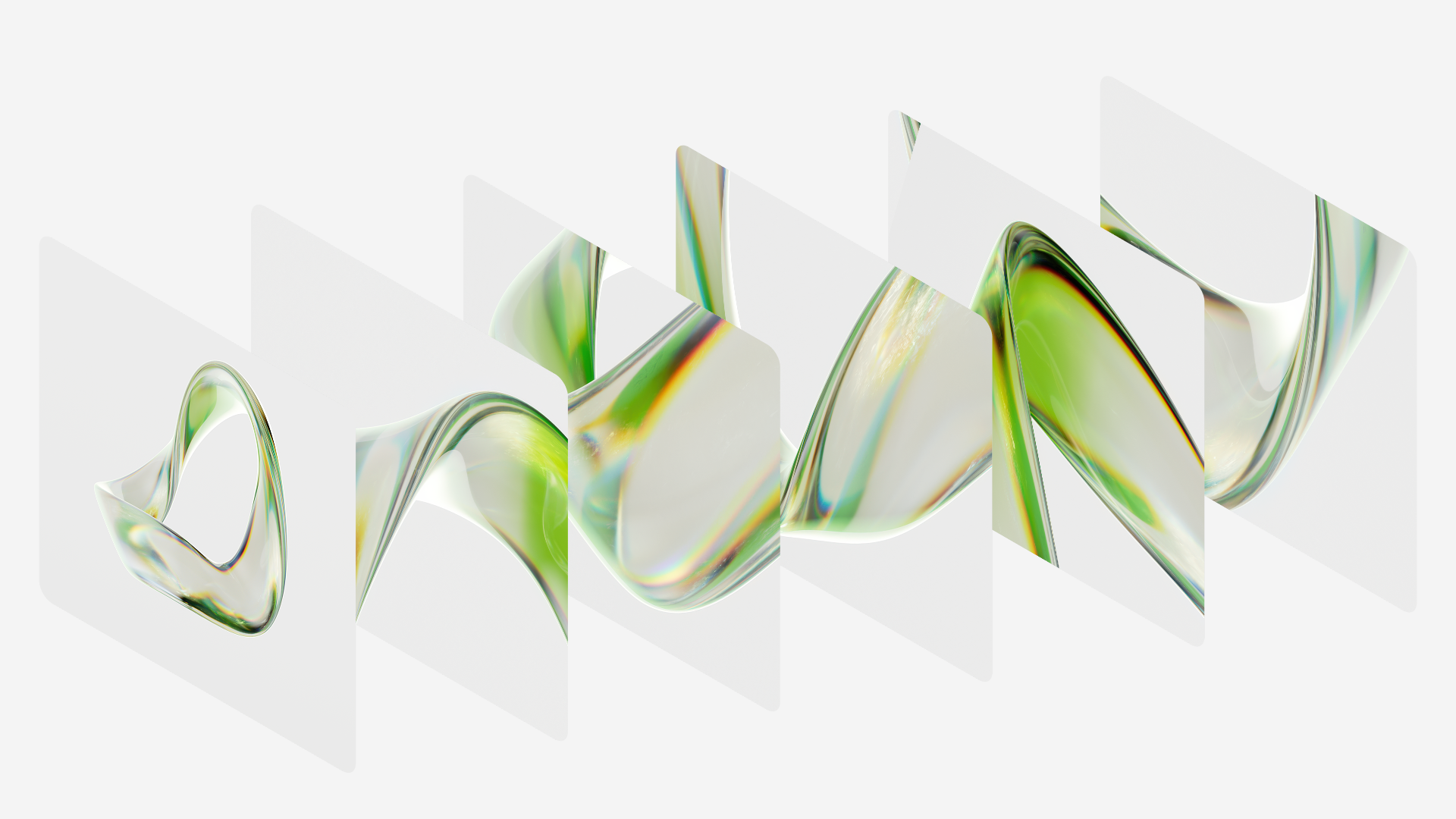
I began with a visual exploration phase, gathering abstract glass references and breaking them down to understand what created a sense of sophistication and “humanness.” From there, I sketched and built shape studies, developing two potential directions: spherical, closed forms, and more organic, open structures. The open route quickly proved the stronger option — it allowed more room for personality, movement, and identity.
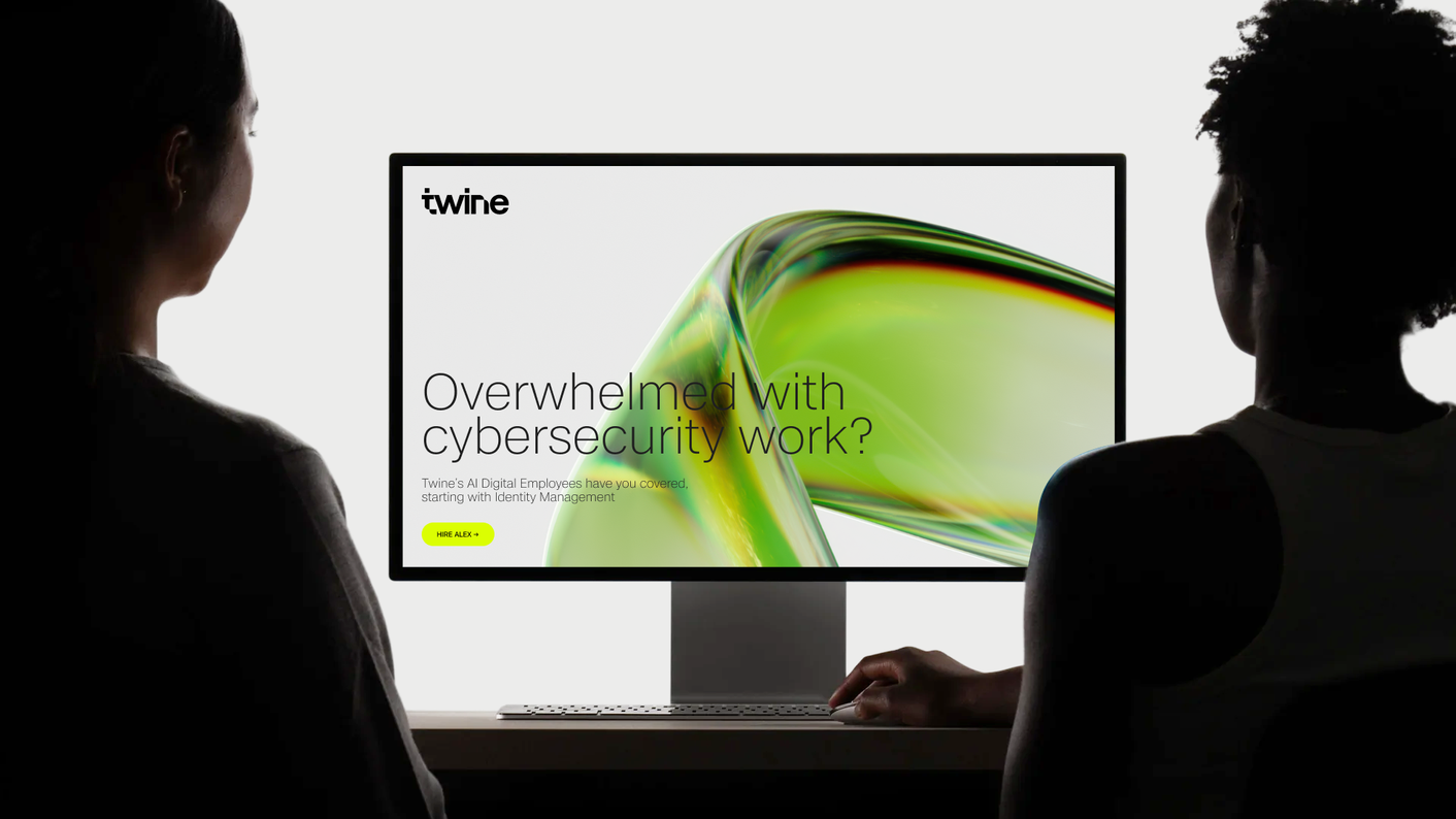
Motion was a crucial layer in defining character. I created early tests to explore how Alex could “speak,” “breathe,” or “respond” to input. Even subtle changes in timing or softness drastically influenced how approachable the assistant felt. Once the foundation was established, I integrated the visuals into real-world brand applications like website headers and product pages to ensure they didn’t just look good in isolation but truly supported Twine’s storytelling.
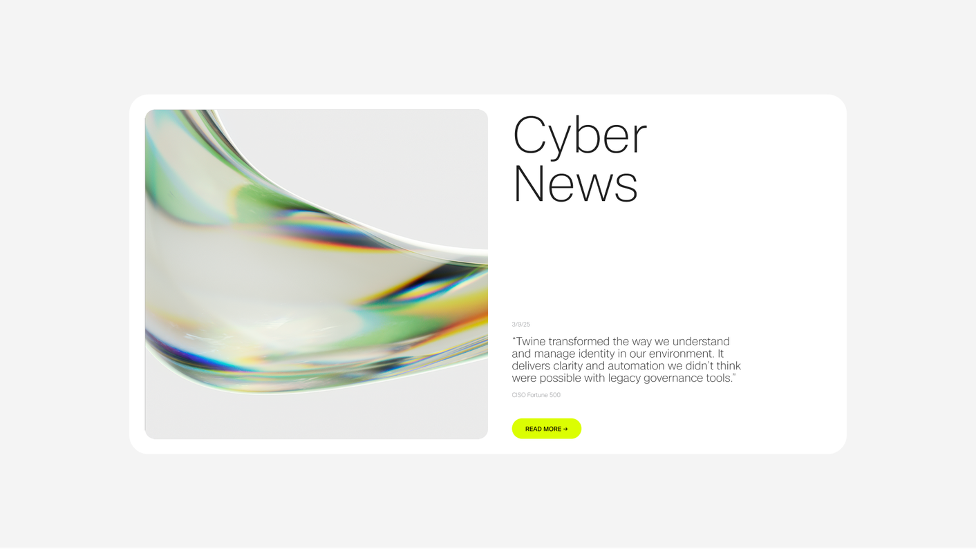
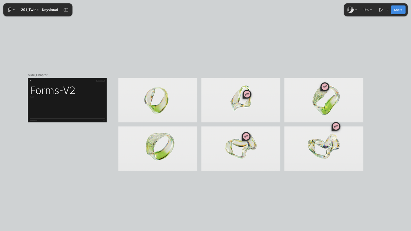
Finally, I expanded the system into a full product palette with one main key visual for Alex, additional assistant variations, a library of close-up brand-world shots, and several animations — including a hero loop, a “talking” version of Alex, and a piece that demonstrates the full range of digital employees. This gave Twine and the agency a complete, cohesive asset library that will support their marketing, sales, and product communication for months and years to come.

"Tobias got the idea right away and turned it into something better than we imagined. The visuals feel smart, approachable, and truly represent what Twine stands for. The 3D direction he developed became a core part of how we Twine communicates the product. He made the whole process easy and brought a ton of clarity to the project."
Adam Yaya-Durrant,
Co-Founder and Design Director at YaYa
Elevate your
Brand Identity
A visual language that emotionally connects to your audience, builds desire, and resonates with your brand's identity can only be built with a strong concept in mind.
✓ 100% Free Consultation, ✓ 100% Risk-Free
